

Appendix · Methodology
Methodology & Design Notes
A short reference for the design and statistical choices that shape the other pages, with citations.
Visual encoding
Charts are chosen by perceptual accuracy, not by what looks novel. Quantitative comparisons use position on a common scale (bars, dots, lines) or position on non-aligned scales (small multiples). Length, angle, and area are used only when position would mislead. Hue and shading are reserved for categorical encoding and anomaly highlighting, never for ranking magnitudes. There are no donuts, pies, 3D, or rainbow palettes anywhere in the dashboard.
Preattentive cues (hue, intensity, size, orientation) are used sparingly — at most one per chart, reserved for what should be noticed first. Amber is the one color that flags "this needs attention"; everything else is neutral.
Sparklines in KPI tiles carry 13-week trend information at almost no pixel cost. Small multiples show each funnel step's WoW conversion independently so a regression in any one step is legible.
Observation-window restriction (the most consequential choice)
Every headline number on the dashboard — overall activation rate, channel LTV:CAC, the Q3-vs-Q4 z-test, the cohort activation trend — is computed on cohorts with a complete activation window observed before the data cutoff. The data window is Jan 1 → Dec 31, 2024 and the activation window is 60 days, so the cutoff for the denominator is Nov 1, 2024; signups after that don't have a full 60-day chance to activate, and including them downward-biases every rate that has activation in the numerator.
The materially-changed conclusion: when you remove the right-censoring bias, the Q4 activation drop is small and not statistically significant (|z| ≈ 0.46), where the unwindowed version shows |z| ≈ 4.6. The apparent Q4 drop is largely a measurement artifact; the structural funnel leak is the real finding.
Statistical conventions
Two-proportion z-test (Q3 vs Q4 activation rate) — pooled standard error under H₀, with α = 0.05 (|z| ≥ 1.96 rejects). Both quarters are restricted to complete-window cohorts so the test is like-for-like. The asymptotic-normal approximation is valid when both np and n(1-p) are ≥ 10 in each group, which still holds after the restriction. P-value is not computed because DuckDB has no built-in erf or erfc and inlining an approximation adds complexity without changing the significance decision.
±2σ noise band for WoW deltas — on the weekly dashboards, period-over-period activation-rate changes are flagged "noise" if the same two-proportion z-statistic is within ±2σ, and "signal worth investigating" otherwise. Prevents reacting to week-to-week random variation.
LTV:CAC benchmark of 3:1 — industry-standard healthy ratio; below 1:1 means the channel is losing money on a 12-month horizon, above 5:1 means underinvestment relative to opportunity. LTV here is gross expert payout per the assignment spec — read the absolute ratios as a payout-efficiency proxy, not a company-level return; the relative ranking across channels is what's load-bearing.
Days-to-activate CDF instead of percentiles — the cohort page replaces p50/p75/p90 with a cumulative activation curve out to 60 days. Percentile reporting on right-censored data is bounded by the censoring point by construction and therefore uninformative about the underlying distribution; the CDF shows the actual shape.
Persona separation and a single North Star
The Growth PM and Marketing Lead pages share the same data model and metric definitions but show different surfaces. Research finds ~61% of dashboard users ignore tiles meant for other roles when one canvas tries to serve multiple personas, so the two views diverge on framing (analytical detail vs plain-language callouts), chart selection (small multiples + reference lines vs ranked horizontal bars + 100% stacked), and the depth of the recommendation block.
Both pages share a single company North Star: activation rate. Blended paid CAC is surfaced on the Marketing Lead page as the primary input metric under the NSM — the lever that role most directly owns. This follows Amplitude's NSM framework prescription: one shared scoreboard, with role-specific input metrics cascading underneath.
Lineage & SQL
The full dbt project lineage — every model's columns, tests, descriptions, and upstream/downstream graph — is hosted alongside this dashboard at /newtonx/dbt-docs/. Each section in the Analysis Detail page links to the specific models it consumes plus a standalone analyses/*.sql file that runs the same logic without dbt.
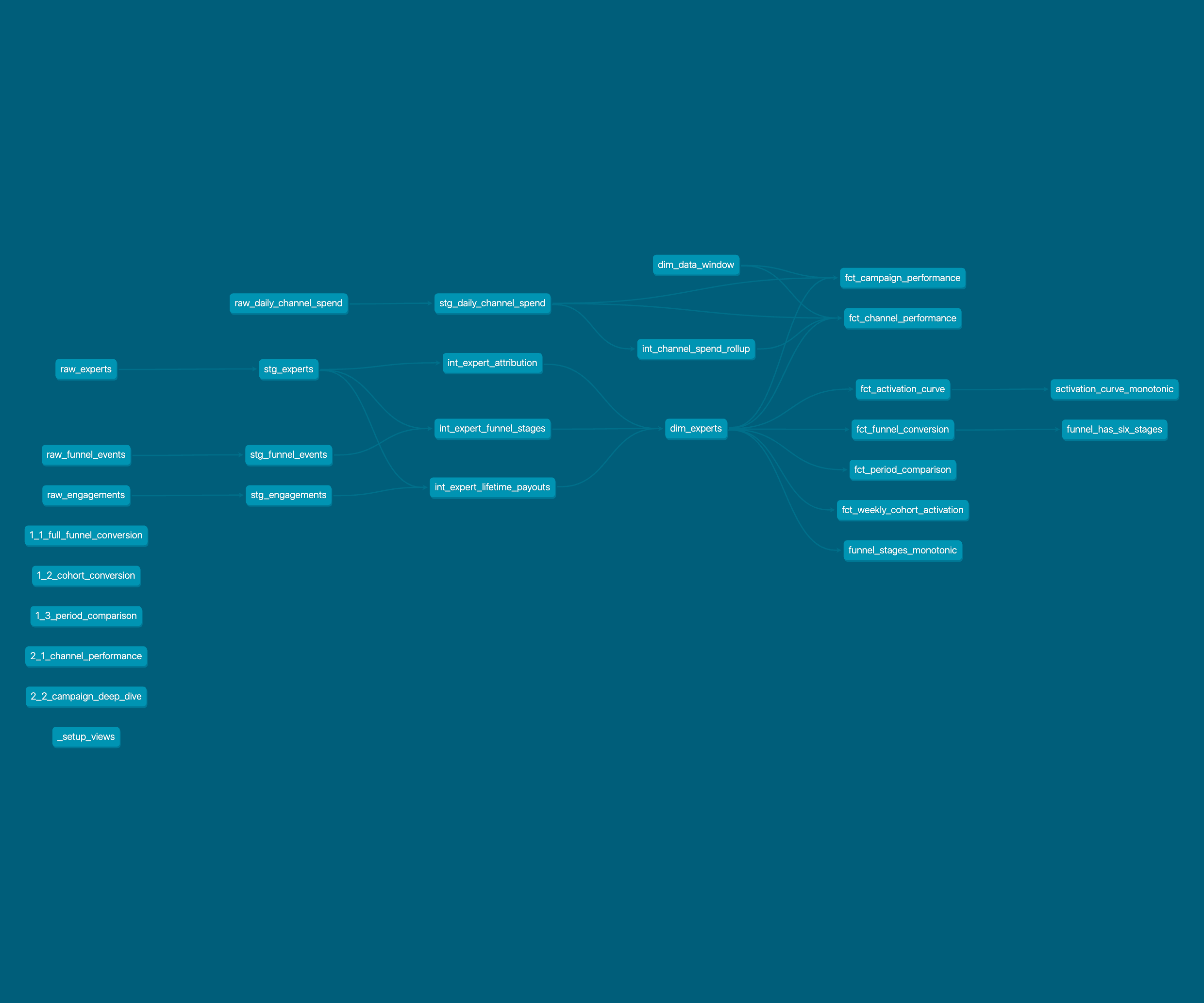
Reading the DAG: raw seeds on the far left (raw_experts, raw_funnel_events, raw_engagements, raw_daily_channel_spend) → staging views (stg_*) → intermediate models (int_expert_funnel_stages handles the monotonic-timestamp + missing-event logic, int_expert_attribution keeps unknown as its own bucket, int_expert_lifetime_payouts builds the 12-month LTV proxy, int_channel_spend_rollup pre-aggregates spend before the join) → the conformed dim_experts dimension that backs every mart → six fact marts answering Parts 1.1–2.2, plus dim_data_window for the cohort cutoff and two singular tests (funnel_has_six_stages, activation_curve_monotonic). Standalone analyses/*.sql files (lower-left cluster) are referenced for grading but don't materialise.
References
- Cleveland & McGill, 1984 — Graphical Perception: Theory, Experimentation, and Application to the Development of Graphical Methods. Foundational encoding-accuracy hierarchy.
- Heer & Bostock, 2010 — Crowdsourcing Graphical Perception. Replication of Cleveland & McGill.
- Schloss, 2025 — Perceptual and Cognitive Foundations of Information Visualization, Annual Review of Vision Science. Modern synthesis.
- CHI 2023 — A Review and Collation of Graphical Perception Knowledge.
- Few — Information Dashboard Design, and Formatting and Layout Matter (Perceptual Edge). One-screen rule, ≤5–9 chunks, data-ink ratio.
- Tufte — chartjunk and the data-ink ratio.
- PMC 2024 — Visual Perception and Pre-Attentive Attributes.
- Geckoboard, 2025 — LTV:CAC benchmark ratios.
- Amplitude / Growth Method — North Star Metric Framework.
- PostHog — Finding your North Star metric.
- Purchasely — AARRR Framework Complete Guide 2025.
- UX Magazine — Four Cognitive Design Guidelines for Effective Information Dashboards.
- Yellowfin / Medium — three-persona dashboards and Power BI persona design.
- Hex / camelAI — cohort-retention visualization patterns.